
Responsive HTML
Make document content work well on every screen.
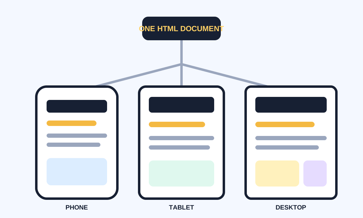
Responsive HTML gives browsers enough information to adapt content across screens, resolutions, input methods, languages, and user preferences. CSS controls most layout, but document metadata, source order, responsive images, and content priority begin in HTML.
Set the viewport and preserve flow
The viewport declaration tells mobile browsers to match the layout viewport to the device width. Fluid content can then wrap naturally. Avoid fixed-width attributes or long unbroken content that forces horizontal scrolling.
<head>
  <meta charset="utf-8">
  <meta name="viewport" content="width=device-width, initial-scale=1">
  <title>Responsive article</title>
</head>
<body>
  <main>
    <h1>One document, many screens</h1>
    <p>Meaningful source order works before layout rules load.</p>
  </main>
</body>- Include the standard viewport declaration.
- Use a logical source order.
- Let text wrap instead of fixing heights.
- Give images intrinsic dimensions and responsive candidates.
- Keep essential content available at every breakpoint.
Adapt images and optional details
Responsive images reduce unnecessary bytes and can change crops when art direction demands it. details and summary can disclose secondary content without hiding it from the document. Do not use responsive CSS to remove information that users still need.