Template shopping used to mean ten browser tabs and one question: which demo looks closest to the brief? For many of us, the search started on ThemeForest. You picked a design, downloaded it, changed the colors, and had something to show before the deadline. That was a sensible way to work. The blank page is expensive. But the first serious change to a modern site is rarely a color. It's a booking rule, a product variant, a saved search, a checkout error, or a mobile flow that breaks when real data arrives. React and Next.js changed how we assemble those pieces. AI coding agents changed how fast we can alter them. We think the useful question has shifted: after the demo wins you over, how much of the actual product has the template already thought through?
ThemeForest proved the model
ThemeForest made that search practical. The catalog was broad enough to find a fit for a restaurant, a shop, or a niche SaaS idea. Live demos let buyers compare work instead of trusting a thumbnail. Reviews, sales history, and established authors supplied context before anyone paid. The marketplace also gave independent creators a way to sell their work. It deserves credit for making templates a normal part of professional web development.
WordPress was central, but HTML, admin, and ecommerce templates mattered too. Browse today's top sellers and you can still see the range. Avada is a good reminder that some products grew far beyond a small theme into whole site-building ecosystems.
The real purchase was time. Show a client a working direction on Wednesday instead of starting every navigation bar and product card from scratch on Monday, and the value is obvious. There are excellent ThemeForest products that still do exactly that. If we're building in WordPress, or need a particular author's mature theme, ThemeForest may be our first stop.
Our argument isn't that buying a template stopped making sense. It's that the work left after purchase changed.
The definition of a template is changing
The old sales pitch was easy to count: twelve homepages, forty inner pages, six header styles. Those options can be useful; a brand running several campaigns may genuinely need them. But a page count tells you almost nothing about what happens when someone tries to use the site.
Suppose a car-rental search returns no vehicles. Does the page keep the chosen dates visible? Can the visitor change location without starting over? If a booking fails validation, do the errors sit next to the right fields, and does focus move somewhere useful? Those details don't photograph well. They are also the difference between a persuasive demo and a frontend you can connect to real inventory.
A beautiful homepage saves a few hours. A coherent product flow can save days.
A frontend template can tackle these decisions without shipping a backend. It can model the states, validate inputs, and make the API boundary explicit. What it cannot do is imply that a payment button charges a card when it only changes a label on screen.
Then there's the source code. A builder will change the original business assumptions. If changing a booking rule requires editing six copies of the same form, the savings disappear. Reusable components matter because they let the next decision land in one understandable place, not because a component count looks impressive on a product page.
The template demo problem
The homepage looks terrific. The product cards have perfect photographs. Then you click a filter and the list doesn't change. You submit the checkout form with empty fields and it advances anyway. The dashboard has a revenue chart even though the product has no orders. On a phone, the navigation takes two taps to close.
This isn't how every template behaves. Some authors build careful, connected experiences. The problem is that a demo optimized to sell a template can hide the work you'll inherit. The unphotogenic states never make the first screen of the listing.
Property search is a good test. Search a neighborhood, narrow the budget, switch from list to map, save a property, and request a viewing. Now remove all the results. Does the interface tell you what happened? Can you get back to the previous search without reconstructing it? A dozen handsome listing pages are less valuable than one path through those steps that actually makes sense.
When we inspect a template, we click beyond the hero. We use the mobile menu, break a form on purpose, and read the product description for words such as “demo” and “integration required.” That isn't nitpicking. It's how you estimate the work between a screenshot and a release.

Five clicks before you buy
Open the live demo, then run through these checks before reading its feature list.
- Break a form and look for clear, field-level errors.
- Try a search that returns no results.
- Use the whole journey at a phone width.
- Reload halfway through a task and see what survives.
- Read the listing for simulated flows and required integrations.
Framer and Webflow raised the design bar
Open a strong template in the Framer marketplace or Webflow's catalog. Notice the typography, the spacing between sections, the way a menu opens, the restraint in a transition. These products raised expectations for what a purchased site should feel like. Visual editing is a real advantage when a designer or marketing team owns the site after launch.
A code-first template doesn't get a pass on craft because its TypeScript is tidy. Focus states, hover feedback, filtering, dialog behavior, and a mobile menu someone can operate with one thumb all deserve the same attention as the architecture. Motion can help explain a change in state. If it delays the next action, it belongs in the bin.
We wouldn't recommend a Next.js source package to someone whose real goal is to edit a portfolio visually. Framer or Webflow may be the better tool. Our buyer wants to go further into the code, change the product rules, and connect services. The design must keep making sense through those changes.
What we're building at SovranCode
SovranCode helps people learn, practice, and ship. The template catalog is our answer to the last part. Today it has three published products. That's enough to show what we mean by a foundation, and small enough that we can be exact about what each one does.
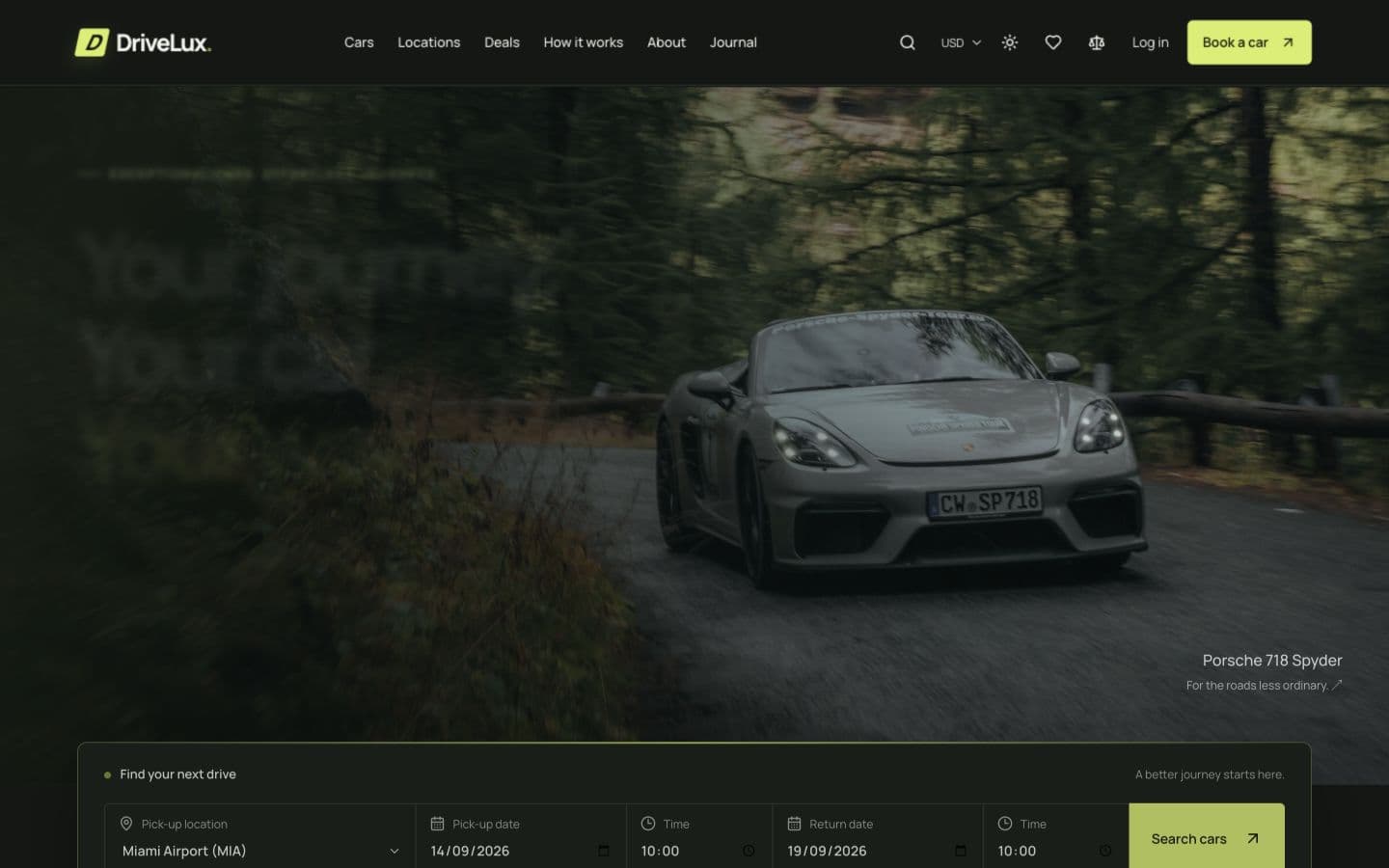
DriveLux is a car-rental frontend. You can follow a customer from pickup details through vehicle search, comparison, a five-step reservation demo, confirmation, and a booking view. There's an operations workspace on the other side. The point isn't that it has a lot of routes. The route sequence shows which decisions a rental product has to make. The data and payment steps are simulated; you still need to connect real inventory, bookings, and payments.
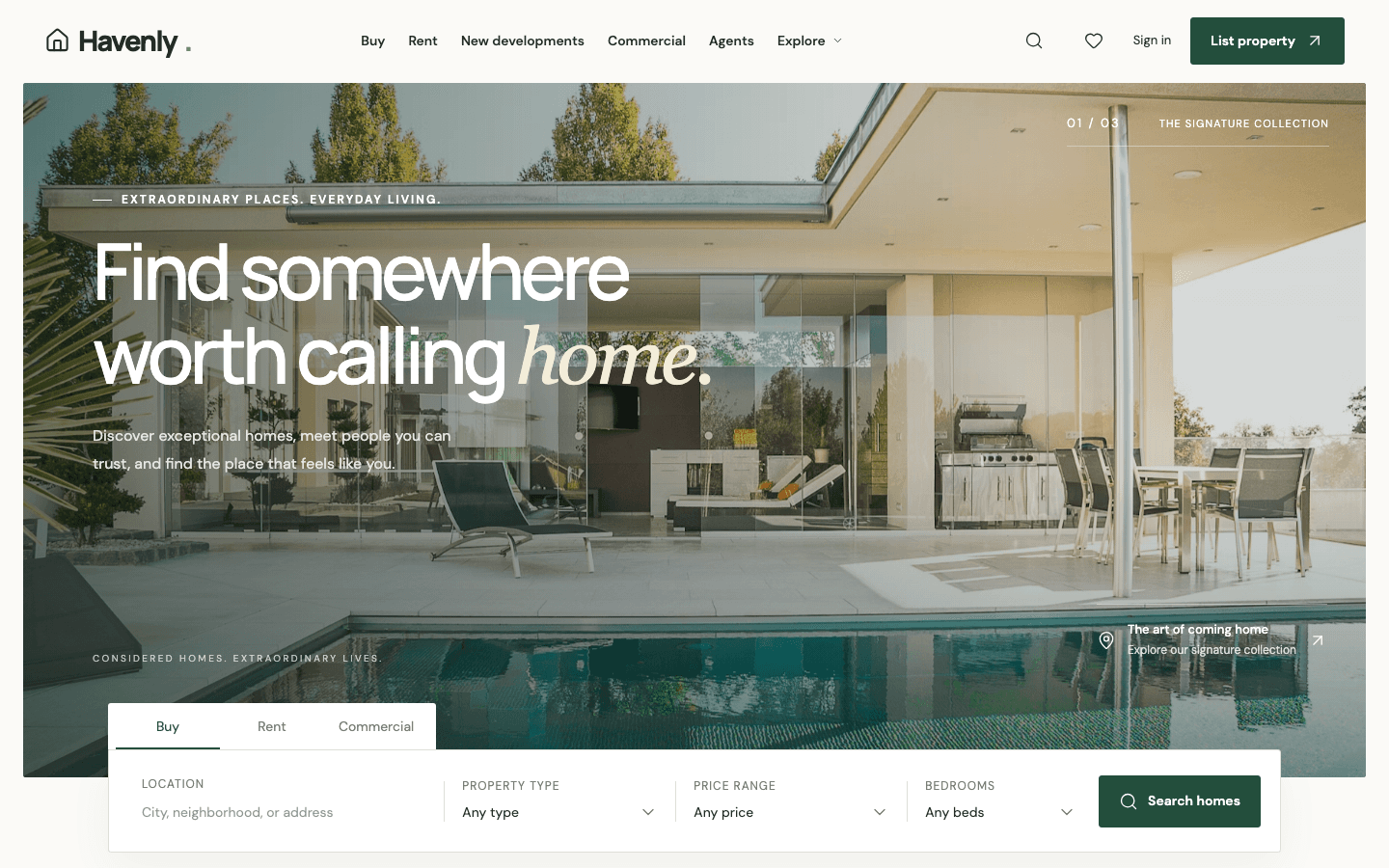
Havenly asks different questions. A buyer searches and saves homes, opens property details, contacts an agent, and moves into viewing and account screens. An agent has listing tools; an admin has a moderation workspace. Those screens are useful because a property marketplace has more than one kind of user. Havenly is still a frontend-only release. Its accounts and listings aren't a production database or authentication service.
Velora starts at the other end of the shopping journey. The campaign homepage matters, but so do collection filters, product variants, a bag that remembers what you chose, checkout validation, customer views, and the admin workspace. The checkout is a frontend demonstration, not a Stripe integration. We say that plainly because a founder budgeting for a commerce launch needs to know the difference.
All three are meant to be opened in an editor and changed. We want the next developer to recognize the product's shape before replacing the sample data. That's the standard we'll keep improving, not a promise that every current screen already connects to a live service.
Design the boring screens too
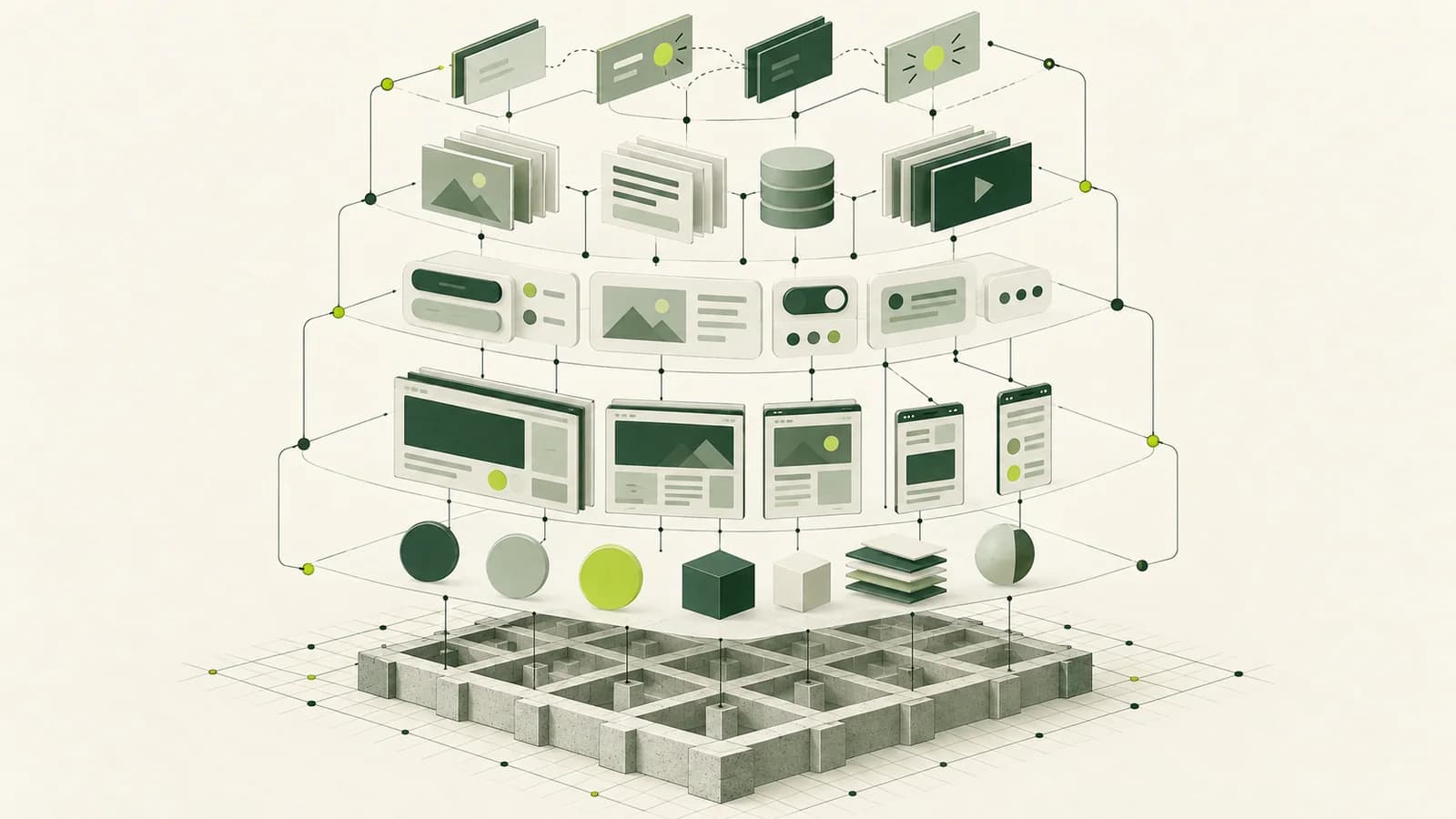
Nobody buys a template because the empty state looks beautiful. Everybody eventually needs one. A search returns nothing. A form rejects an email address. Inventory changes between browsing and checkout. A customer opens an account before placing an order. If the template only looks right with its sample data, the first real data import will expose the gap.
The screens nobody puts in the marketplace thumbnail are often the screens developers spend the most time building.
A rental form should keep the chosen car visible when the dates are wrong. An unavailable vehicle needs an explanation and a way back to search. Extras should change the price summary before confirmation, not surprise the customer at the end. None of this requires the template to own the final booking API. It requires someone to design the states the API will drive.
Semantic HTML helps here too. A labeled field and a correctly placed error message are easier to use and easier to wire up than a styled div pretending to be a control. Give keyboard focus a visible home. Tell the visitor what to do after a no-results search. That's real interface work, even when it won't appear in the first screenshot.
Frontend edition and complete edition are different promises
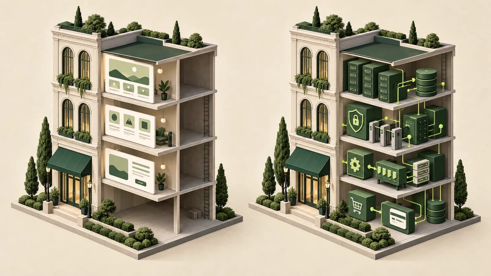
If your team already has an API, database, identity provider, and CMS, paying for another backend would be wasteful. You need the interface, its components, the responsive flows, and a clean place to connect your services. That's what our three published templates currently sell. Their listings describe the package; the license guide explains how you can use it.
A complete edition is a different contract. Depending on the domain, it could add authentication, persistence, APIs, admin operations, business rules, or payments. Shipping those pieces also means owning migrations, credentials, security, deployment, and failure recovery. We would only use the word “complete” for an edition whose listing states exactly which of those things work and which the buyer must configure.
Don't make a frontend developer pay for a backend they don't need. Don't make a founder believe a frontend demo is a finished application.
DriveLux, Havenly, and Velora are frontend-only today. The edition model is where we want the catalog to go when a product merits a deeper implementation. The distinction should be visible before anyone pays.
AI changes what makes a template valuable
Ask a coding agent for a hero, three feature cards, and a pricing section. You'll have something plausible before lunch. That makes a bundle of generic markup a harder sell. It doesn't make a good product foundation disposable.
Give the same agent a rental flow with named booking states and a clear availability boundary. Now the request can be specific: “Fetch real availability here, keep the selected vehicle when dates change, and add a test for an unavailable return location.” In a storefront, the request might be to connect product variants to an existing commerce API without changing the bag UI. The agent has a map to work from. The developer still has to inspect the diff, run the tests, and check the failure cases.
The better the starting point, the more useful the agent becomes. When component ownership is obvious, a change has fewer places to go wrong. When sample data and service boundaries are named, an integration doesn't require guesswork. Our guide to AI coding agents goes further on permissions and review; speed only helps if the team can understand what shipped.

Which starting point would we choose?
We'd buy from ThemeForest for a WordPress or WooCommerce project when a specific theme, author history, and a large ecosystem matter. We'd choose Framer for a visually ambitious portfolio that a designer will edit. Webflow makes sense for a marketing team already using its CMS. These aren't consolation prizes; they're good tools for those jobs.
SovranCode is the better fit when one of our current domains matches your project and you intend to keep building in code. A rental business, property platform, or fashion storefront has decisions that go past its homepage. Our catalog is small, so if your project doesn't fit, we'd rather say so than dress up an unrelated template.
Price is only the first line of the estimate. Ask how you will edit the site six months later, who will apply dependency updates, and whether your license covers the client's intended use. A visual builder can be cheaper to maintain for a team that never wants to touch code. A source package can be the better deal when engineers expect to replace large parts of the product. Neither answer fits every team, and a low checkout price won't rescue a template that fights your workflow.
| Platform | Strength | Choose it when |
|---|---|---|
| ThemeForest | Broad selection and established theme ecosystems | You need a particular WordPress, WooCommerce, or traditional site template. |
| Framer | Visual polish and direct editing | A designer-led marketing site or portfolio is the product. |
| Webflow | Design-led sites, CMS, and visual workflow | Your team already builds and maintains sites in Webflow. |
| SovranCode | Curated, code-first product foundations | You intend to extend a relevant frontend product flow in code. |
Whichever route you take, inspect the exact item. Click a complete task, read the support and license terms, and ask what the demo leaves for you to build. The marketplace logo won't answer that.
If you have an afternoon, do a small trial change before committing the project to a template: rename a field, add a filter option, and follow that value to the next screen. You learn more from that one edit than from a hundred polished preview images. If the code is closed, ask the author for documentation or a representative component. You are buying the next month's work as much as today's launch.
What every SovranCode template should earn
Every release should answer one uncomfortable question: why would a developer keep this code after the demo? A coherent journey is part of the answer. So are sensible component boundaries, responsive behavior someone designed on a real phone width, and states for the moment things go wrong.
The listing has to earn trust as well. Name the edition. Show the dependencies, included source, license, support, and integration boundaries. If the payment step is simulated, say so in the product description. Plausible sample data is useful; pretending it's live isn't.
A keyboard user should be able to reach the filters and understand an error. A mobile visitor shouldn't have to download a giant image to see a product card. We haven't finished perfecting any of this across the catalog. The standard matters precisely because each new release gives us a chance to test it in public.
- A real journey, with the empty and error states that come with it
- Reusable components and understandable code boundaries
- Mobile interactions and accessible controls
- Transparent edition scope, licensing, and documentation
Bigger isn't automatically better
ThemeForest wins on selection. Framer has an extraordinary creator ecosystem. Webflow has a visual workflow many teams already trust. We don't need to copy their size or their editing model. SovranCode can pick fewer domains, take the product flows seriously, and make the source understandable to the person who inherits it.
That fits the rest of SovranCode. People learn a concept, practice it, then need a decent foundation when they're ready to ship. A template should shorten the repeated work without hiding the decisions that belong to the builder.
We're not trying to recreate ThemeForest. We want to be the place a developer checks when they think, “I could build this from scratch. I'd just rather start from something good.”